
Raise the roof

Illustration for the Heliconian Club’s Raise the Roof fundraising campaign.
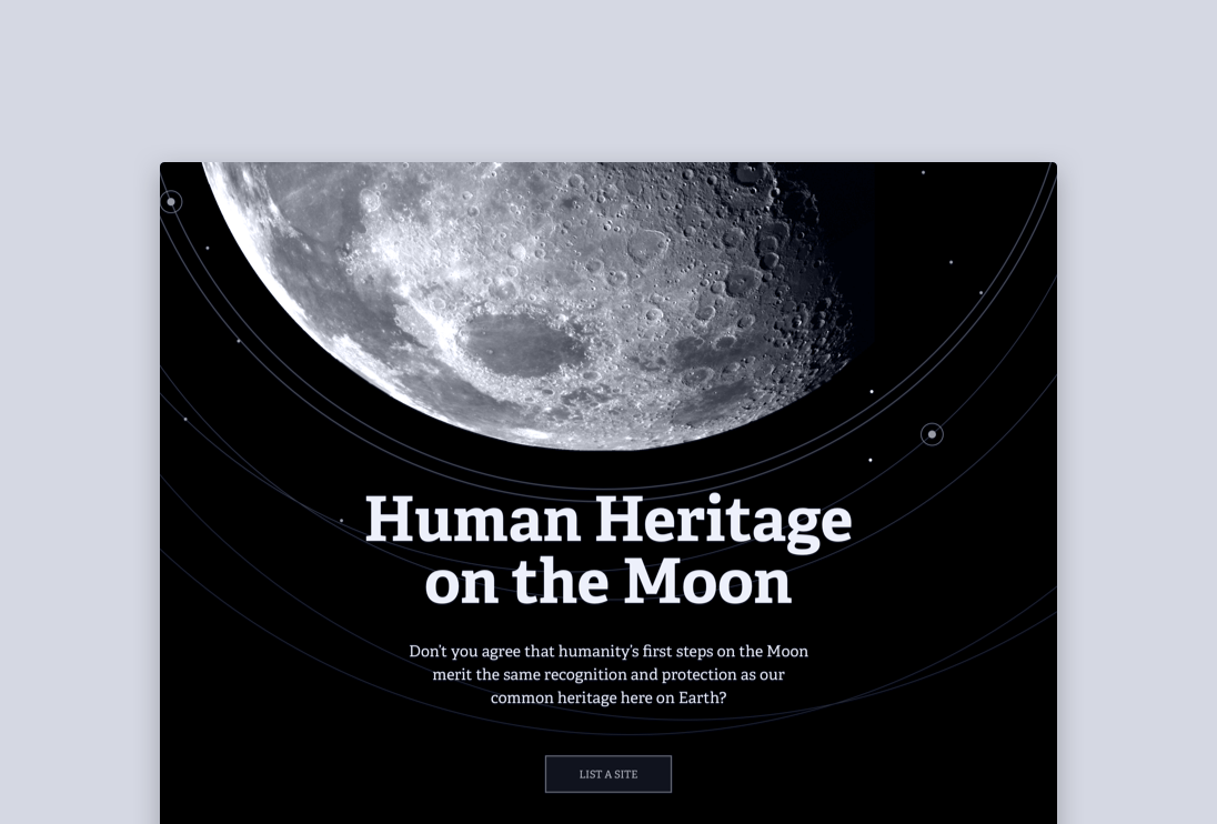
Human Heritage on the Moon
For All Moonkind has an ambition — to educate the public about the human heritage on the moon by creating an online registry that archives moon landing related artifacts that are approved by archeologists and space scientists.
—
Role: Strategy / Design
Collaborate with: Founder / Technical Lead / Project Manager / Archaeologists and Space Scientists
—
Getting Public Recognition
One of the primary mission of For All Moonkind is to get the public enthusiastic again about our space missions globally and throughout history.
To achieve this goal, I was commissioned to design a set of high fidelity mockups for a public-facing web pages that will make people excited about moon landing sites.
Visual Research
I gathered inspirations with elements that may be of visual interests when planning for the design, since I know that the goal for this set of mockup is more about public promotion, therefore it’s more important to produce something that’s visually impactful.
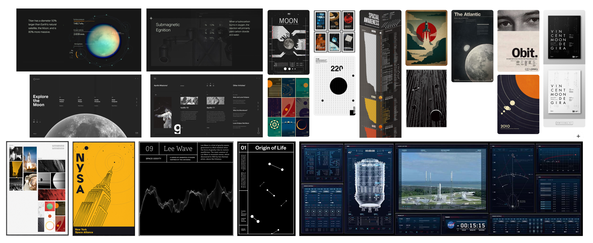
Visual Identity
The visual identity is kept minimum with a sci-fi look and feel with light on dark elements.
Telling a Story
Although the primary function of the registry site is to be catalogue all artifacts from the global moon landing sites, storytelling may be the best way to get people excited about the space missions.
When presented at an UN conference, it was very positively received.
(The data presented on the set of mockups is not accurate, and is meant to be placeholders.)
A Rigorous Review Process
The working group that consists of archeologists and space scientists are very concerned about the dignity and accuracy of the data being stored and presented on the registry. Unlike Wikipedia, where crowdsource editing is encouraged, the working group wanted a very rigorous review process that consists all the essential steps to ensure both the data and metadata are recorded accurately.
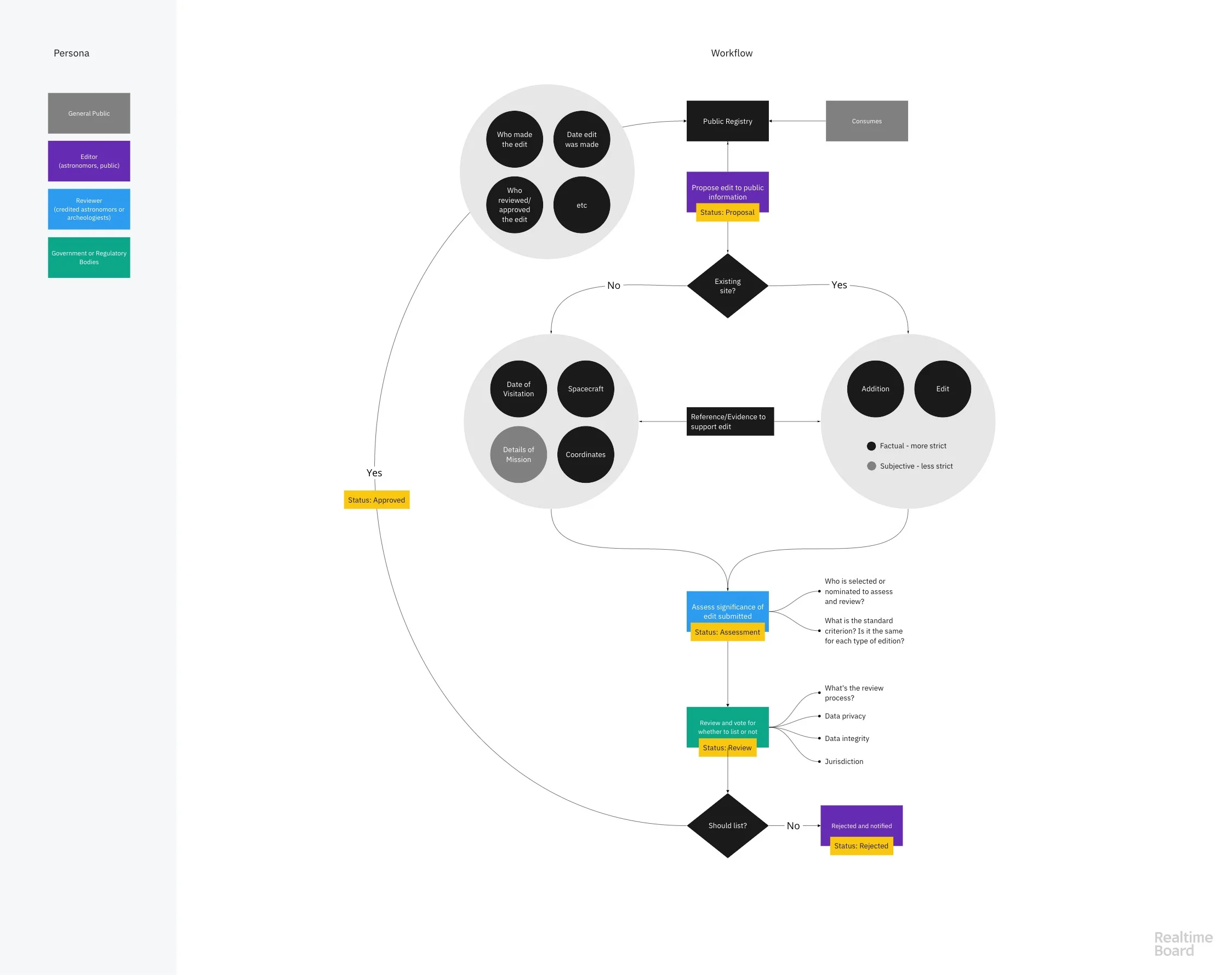
The flowchart of what the process of the submitting, reviewing, and approving data related to a moon landing artifact to be recorded in the registry.
Data Structure
Internally, we had to structure the data to develop the archive. To approach this, I looked at museum websites and online archives, and came up with a basic structure.

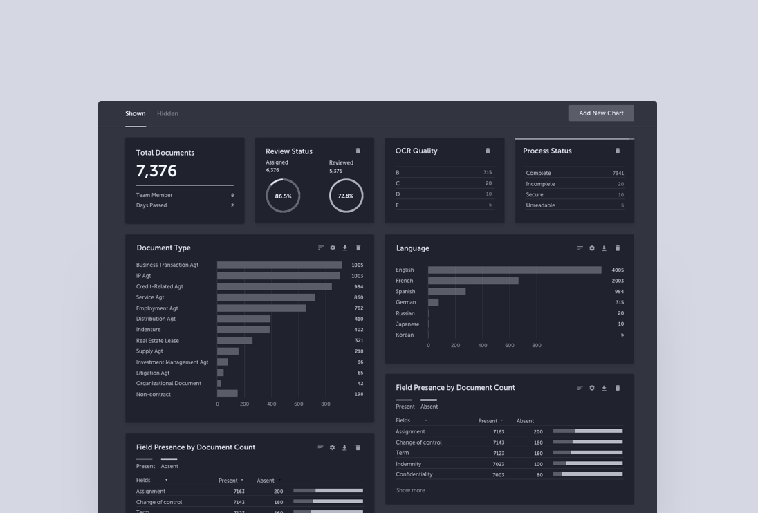
A Review Dashboard
A Review Dashboard is what accredited scientists of the registry have access to, in order to manage their review and approval process of data entry into the registry.
Previously, when presenting the design to the scientists from the working group, it wasn’t immediately clear that the design is not meant to be accurate or finished—instead, it is a visual representation of what the final product could be, and a visual cue to get their responses and feedback in order to move on to our design and development next stages.
Ideally, I would rather run some participatory design working session with the scientists to understand their expertise, concerns, and preferences. However, it is quite challenging to get much time with the scientists, we had to be as strategic and careful as we could to explain the design when we did get a chance to present to them.
To even better clarify the design, so that the scientists don’t get sidetracked by placeholder texts, I annotated each elements on the dashboard.
Next Steps
This project is still ongoing. The next step for design is to sketch out the entire review flow that is intuitive and can ensure data accuracy and dignity during the review process.
More Than Just Visualization
Like any enterprise product, the dashboard is one of the most requested features by users—partners, senior associates, project managers, and administrators. Each has their own goals and tasks that require different sets of data that can help them achieve their goals. The possibilities of what can be placed on the dashboard is endless, the question is — which ones will provide the most values to those that may benefit from them the most?
—
Role: Design / Research / Product
Collaborated with: Product manager / UX researcher / Developers
—
Background
Kira has been a beloved tool among law firm associates and other contract review experts, as most of the earlier features were developed to do the heavy lifting of document review and analysis work. Now it’s time to ask ourselves — how would we help law firm partners and other senior people who may not be in the trench doing the work, but can equally benefit from the insight we can provide?
There are places in the app where both high-level and more granular information is provided, but due to a lack of cohesion in the way information is organized, it requires a bit of navigation in order to find useful information.
Research
Having worked on a previous project that gave us some insights into the kind of information that was requested by each main persona, we decided to start the Dashboard project with partners, senior associates and project managers—those who care the most about high-level information but probably in different ways.
Planning for research
To understand the how a dashboard can serve their needs, we kicked off a round of descriptive research to validate a set of assumptions.
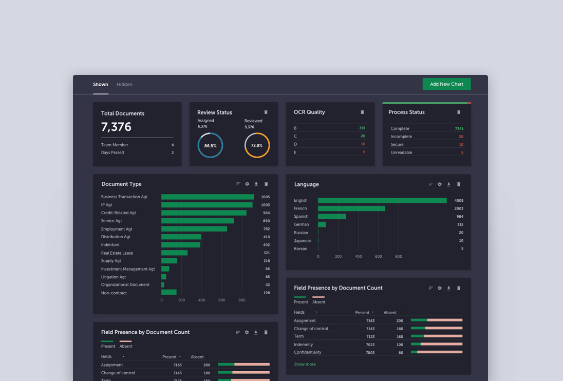
A detailed research plan that consists of the persona, what we try to find out, and the questions to ask in.
Descriptive research
Since this is descriptive research, we produced a set of lo-fi mockups that captures some ideas we have heard from our users in the past and present it them to the research participants in order to gather more concrete feedback.
Analysis
We transcribed research recordings into Dovetails, where we could code the transcripts flexibly.

A screenshot of how we coded the user research transcripts.
Synthesis
After going through the codes and user quotes, we summarized them into a few themes, which we then translated to four main “how might we” design challenges.
It was quite clear at this point that the ability to provide clear, high-level, real-time information that gives partners or project managers a good sense of what’s in the project and what’s going on is the greatest value of the dashboard. However, the ability to drill down into details if needed is also important.
Challenges
Displaying and visualizing the data is the easy part. The hard part is how we tell a story with the dashboard so it’s not just a pile of charts and eye candies.
In order to craft a story, we did a thorough mapping of datasets available in the product and how they address users’ needs.

Configurability
Other than having a set of default visualizations that tell a story which helps partners and project managers make sense of their projects and status, it is important to make the visualization configurable. However, the overlaying of different facets of data poses a significant design challenge.
Audit of datasets
In order to make sure overlaying the different sets of data makes sense, we did a complete audit of all the data available.
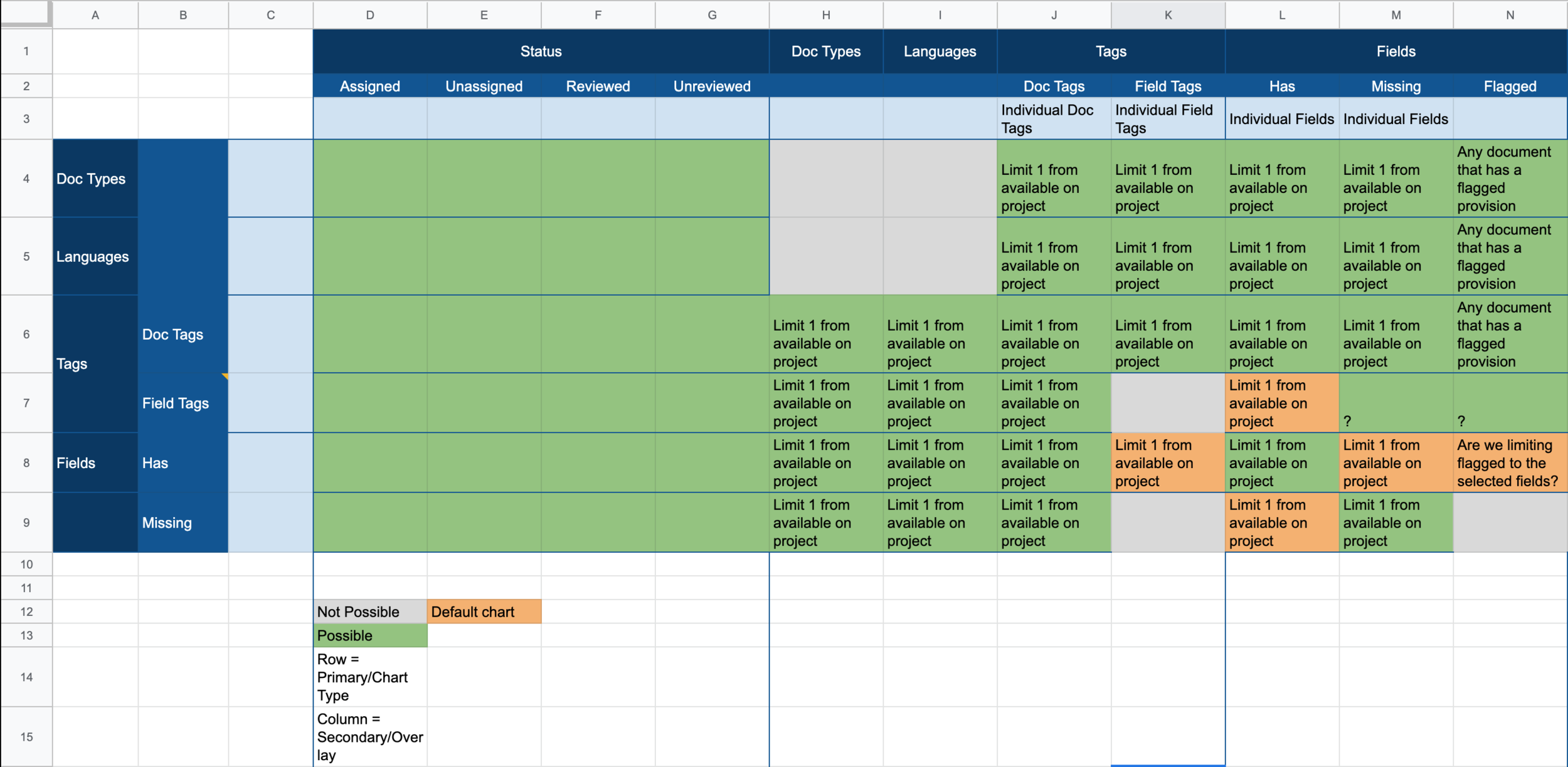
We used google sheet to collaborate with the product team to map out all the available sets of data and how they can be combined.
Complex, but not complicated
Once auditing of the data sets are done, we sketched out the experience for the configuring and creating a chart.
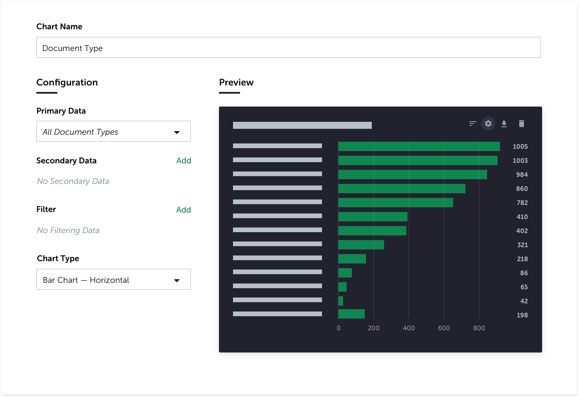
The initial idea of how to confiture an existing chart.
The experience of adding data to configure the chart that will provide the the level of granularity and data combination that will be helpful for specific use cases according to users’ needs.
Scope
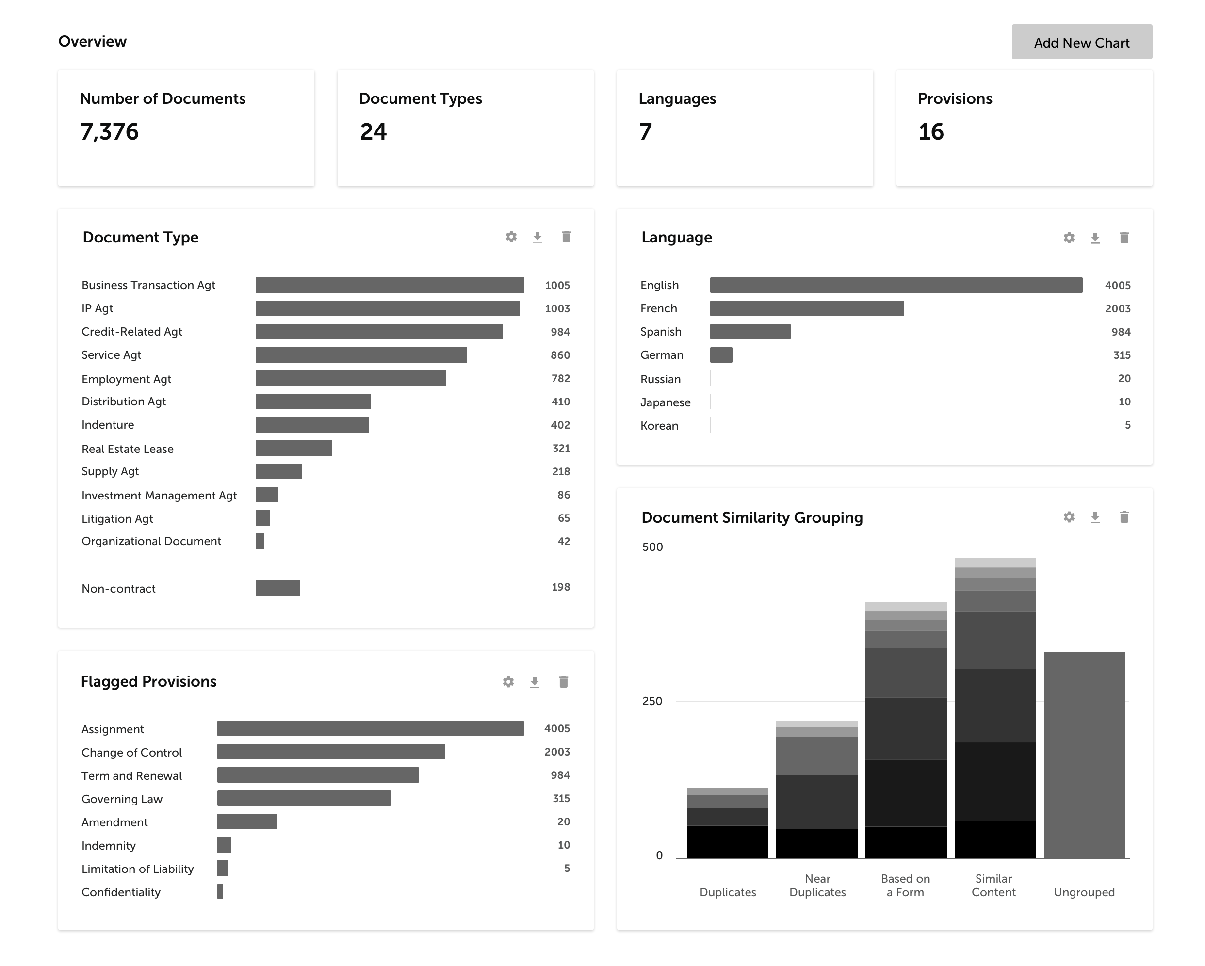
To better the scope for the feature, we intentionally limited the chart type to bar chart, donut chart (which already exited in the app), and tabular.
Since we were also in the middle of auditing and refining the our design system, I also kept the colour palette of the chart to a minimum.
Takeaway
Designing a feature like dashboard, it is very easy to get distracted by fancy visualizations and lose sight of its primary goals and jobs to be done. It is important to always go back to the research learnings to keep track of those goals.
Be collaborative to make sure everyone is on the same page with feature scopes at all times.
Each product design project can be very different in terms of challenge and focus. In this case, auditing data structure, mapping how datasets can be combined, and designing for an intuitive configuration flow were the bigger challenge than coming up with the sets of visualizations to present.
The Swiss Knife of Legal Document Review
—
Role: Product / Design / Some Development
Collaborated with: Development
—
Kira in a Nutshell
Lawyers read a lot of contracts, sometimes very long contracts, sometimes under not a lot of time.
For a very long time, lawyers did this with pen and paper—print out the documents, read the documents, highlight the key clauses, type up the summary report. The process was manual, time-consuming, and tiring. Even with the help with document reading and generating softwares, there is still a lack of an all-in-one tool where lawyers can read, extract, and summarize documents in one place.
Along came Kira.
At its core, Kira helps legal professionals read, extract, and analyze documents faster and more accurately, by using machine learning to automatically identify and extract key clauses (i.e., “provisions”) in contracts and summarize them. It also allows users to train their own models of provisions from documents.

The process of a review project.
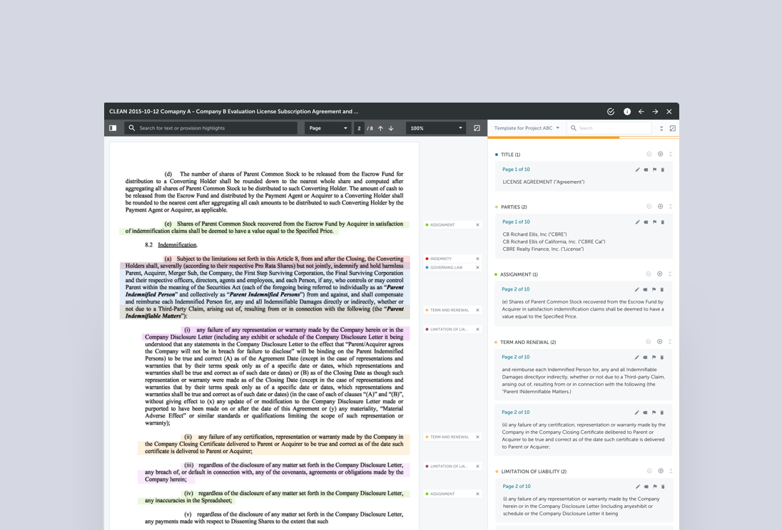
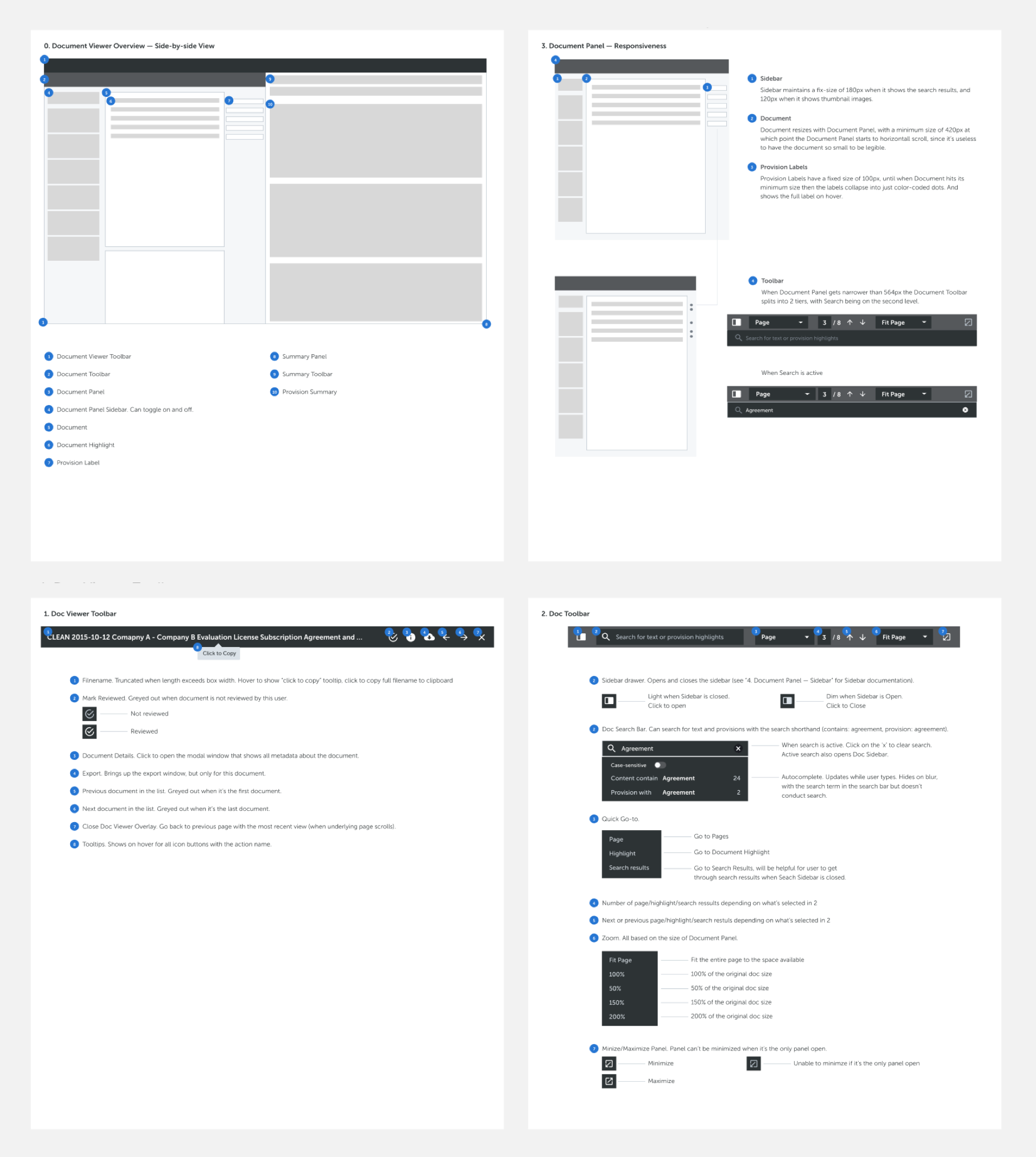
The Need for a Native and Full-featured Document Viewer
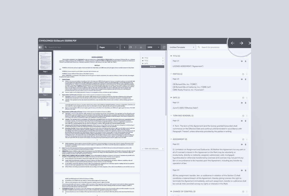
Since documents themselves are still at the heart of any review project (such as due diligence for Merger and Acquisition transactions), our users will spend the majority of their time with documents. A full-featured document viewer, which allows users to view contracts, highlight relevant text, and summarize text that the system has identified as important to their use case, is no doubt a crucial component to Kira’s success.
Document Viewer, Previously…
The original document viewer had three constituent components:
A document pane that allowed users to read the documents and annotate particular portions of text as being relevant to a particular need
A summary pane that allowed users to view manually and automatically generated annotations
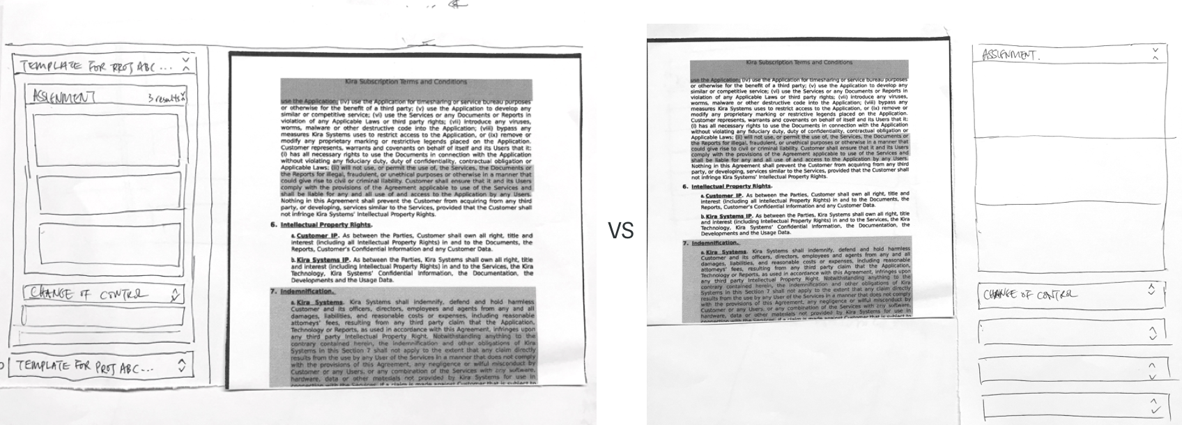
A document listing tab that allowed users to navigate from one document to the next using a directory structure.
There were various usability and functional issues presented in the old version of the document viewer, since it was developed when the first version of the product launched and no user research or testing was conducted during its development phase.

The previous version of document viewer, where the document and summary pane overlay on top of each other as a solution to responsiveness. This creates some usability and aesthetic issues.
An initiative
In my first few months with Kira, I sketched out some low fidelity mockup for the document viewer redesign (which was not a product priority at that point), trying to address the usability issues I discovered. In this set of mockups, I considered different layout options, functionalities that may be applicable for generic document review tasks.
At this early stage of Kira, there were not many users, making it challenging to properly user test my design directions. This set of mockups were presented to a few users and received some positive feedback. However, since it was not the product priority at the time, I moved on to work on other features, and didn’t come back to it until a year later.
A Year Later…
By this time, I have accumulated much more knowledge about both the due diligence process, our users (who were mainly M&A transactional lawyers by the time), and the technologies behind Kira.
Kira was still a growing team, both the design and development teams were small and nimble. We also had a fair bit of autonomy in setting priorities.
On the other hand, we have gotten more users, and I was able to talk to users about their process, goals, and challenges working with Kira. All factors made it seem the right time to redesign the document viewer.
Document Viewer in Contexts
To effectively redesign the document viewer, I had to first zoom out to understand the paths users take to get to this point based on their goals and tasks.
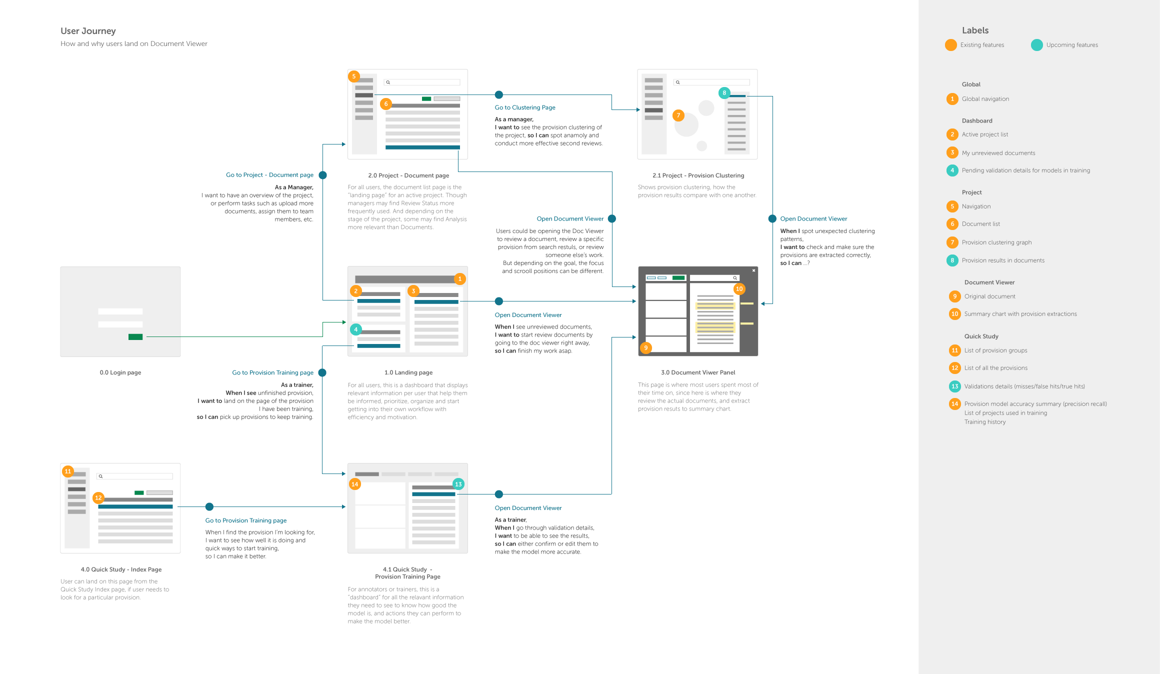
The paths users may take to land on document viewer according to their roles, based on the navigation of Kira by the time.
Different roles, different needs
There are three primary persona who will frequently use the document viewer.
It is apparent that the different roles determine the way users land on the document viewer and how they will use it. In order for this interface to accommodate the various use cases, I had to first understand what they are.
After talking to a few users and internal legal experts, I made a list of all the job stories based on their roles, what’s important, and some possible solutions.

“When I review the documents assigned to me, I want to go through the list without disruption, so I can keep in the flow. ”
“When I read a document, I want to search by keywords as they are usually a good indication of where the important clauses are, so I can read and review them. ”
“When I review the summary, I want to only review the ones I care about so I can save time.”
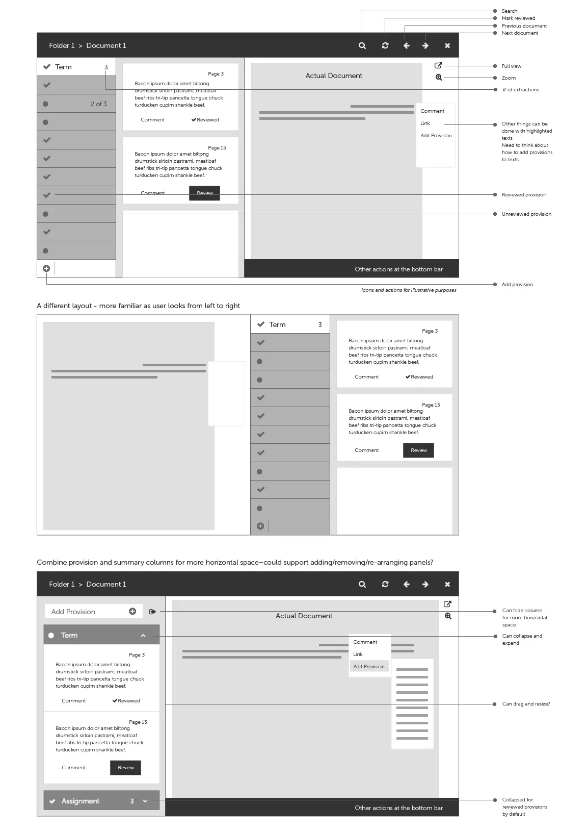
Designing the Document Viewer, One Piece at a Time
Once I understood the use cases and some important functionalities that are needed for the new document viewer, the next step is to piece them together to make it work.
Layout
The users’ goals and tasks determines how the document viewer will be laid out, as hierarchies will be designed based on what users’ priorities and habits are.
Some early sketches exploring different layout options
Testing the layout with paper prototypes — turns out document on the left and summary on the right feels more familiar for people.

Some early mockups exploring different view modes in Document Viewer including full-page document view and summary view.
Navigation
A few usability issues related to navigation were tackled with the redesign.
First, in opening a document, instead of being redirected to a new page, the document opens on top of the current page and its context, and the user can “exit” the document by closing it.
Secondly, users usually land on the document viewer from a list (e.g., “documents that are assigned to me” or “documents in this folder”), it is ideal if they can just keep going down the list without being interrupted by undesirable navigation issues. Thus I added the ability to navigate to previous or next document in the document list from the toolbar.
So many functionalities, so little space
One of the biggest challenges designing the document viewer is the constraints in screen space considering all the dense information and functionalities that need to be displayed in order for the users to fulfill their tasks.
—
How might we fulfill the needs for the different roles and use cases without losing focus by trying to fit everything on the screen?
—
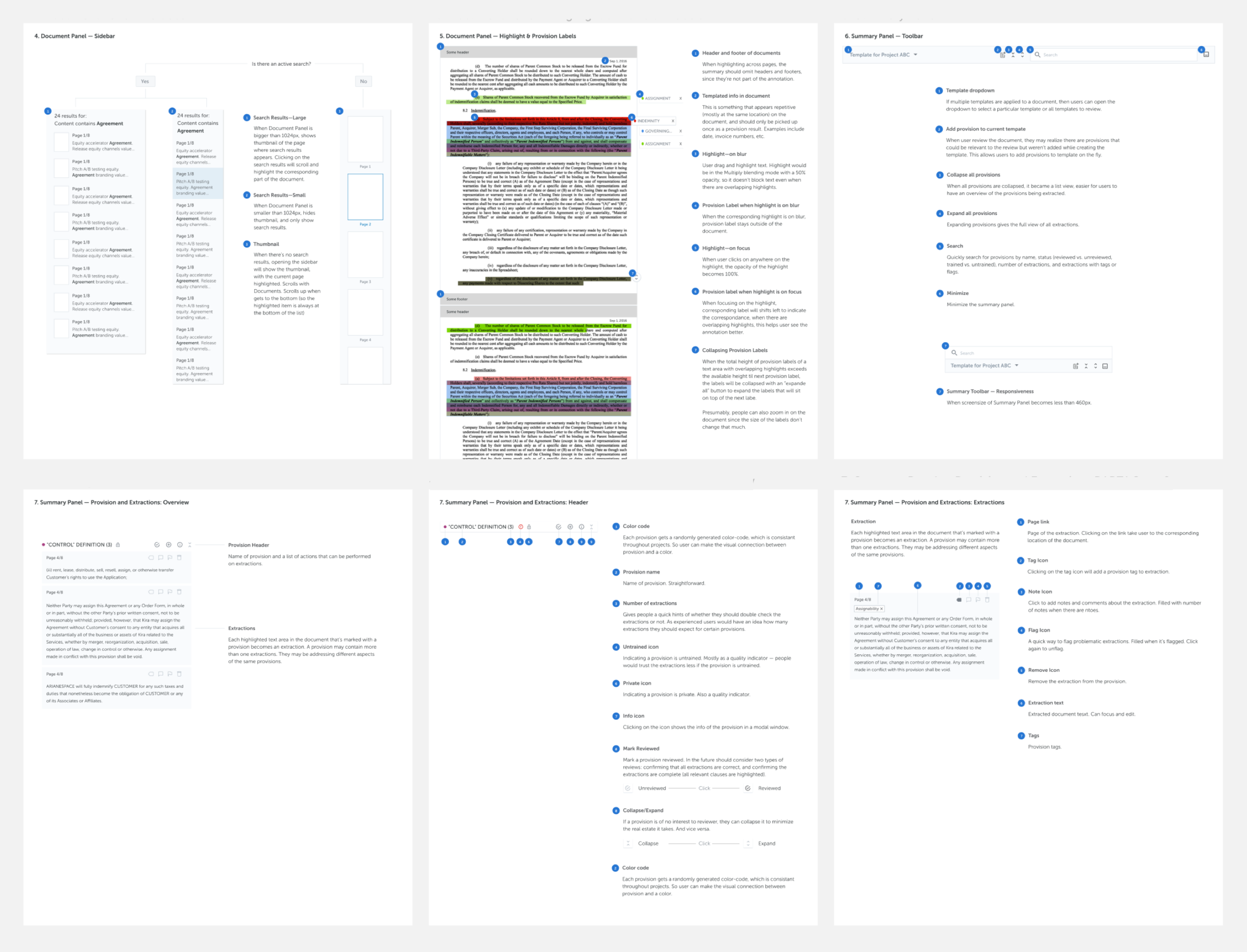
To solve this problem, some configurability was designed to allow users to adjust the interface according to their needs. In particular, users can adjust the relative sizes of the Document and Summary panes by dragging the intersection. They can also choose to expand either pane to be the “full view” if they wish to focus on that pane based on their workflow. Additionally, zoom functionalities are added to the document view as sometimes the scan can be too small to read comfortably.
The toolbar in the Document Pane. Many different types of functionalities need to fit into half of the screen width.
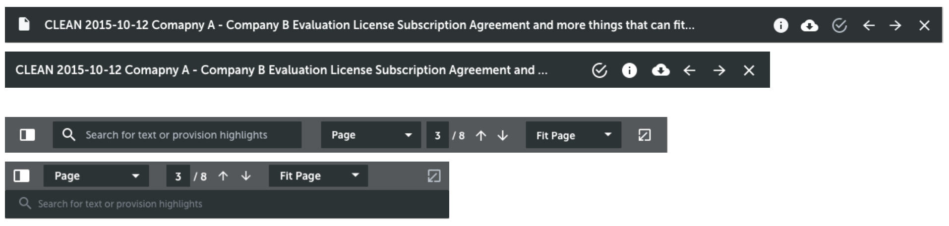
Responsive toolbars.
The other design decisions I made was to hide some metadata of the document. Those were definitely “nice to have” information that some users asked to see upfront, however, all things considered, it is the most reasonable to hide those based on the 80/20 rule.
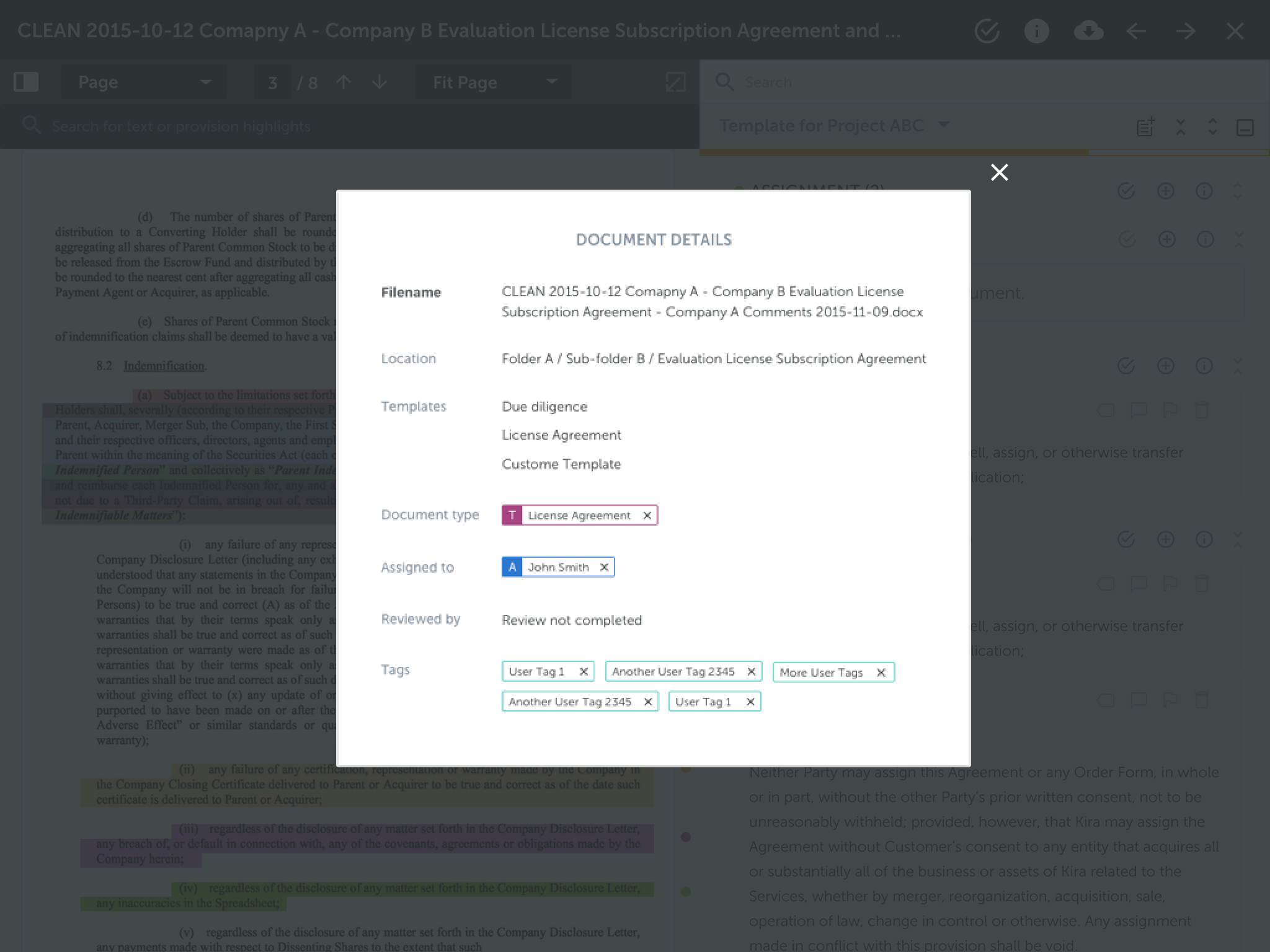
Document metadata such as type, tag, review tags are displayed on a modal and only accessible by clicking on the “i” icon button from the top toolbar.
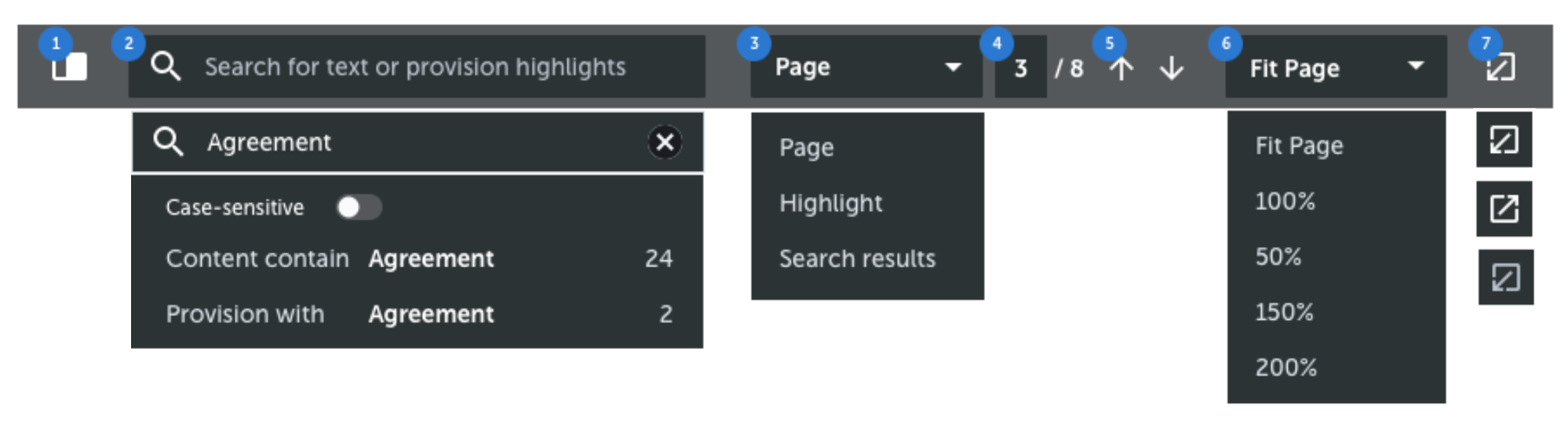
Search
We know that one of the most common way users look for a particular provision is to use the keyword search to look into the document. However, keyword search may not be the ideal search when it comes to summary pane, as users are more likely to search by metadata of provisions in the summary.
By this time, we have already decided to allow maximizing and minimizing both the document and the summary pane. Therefore it makes sense to allow users to search within each pane for the information they need given the context.
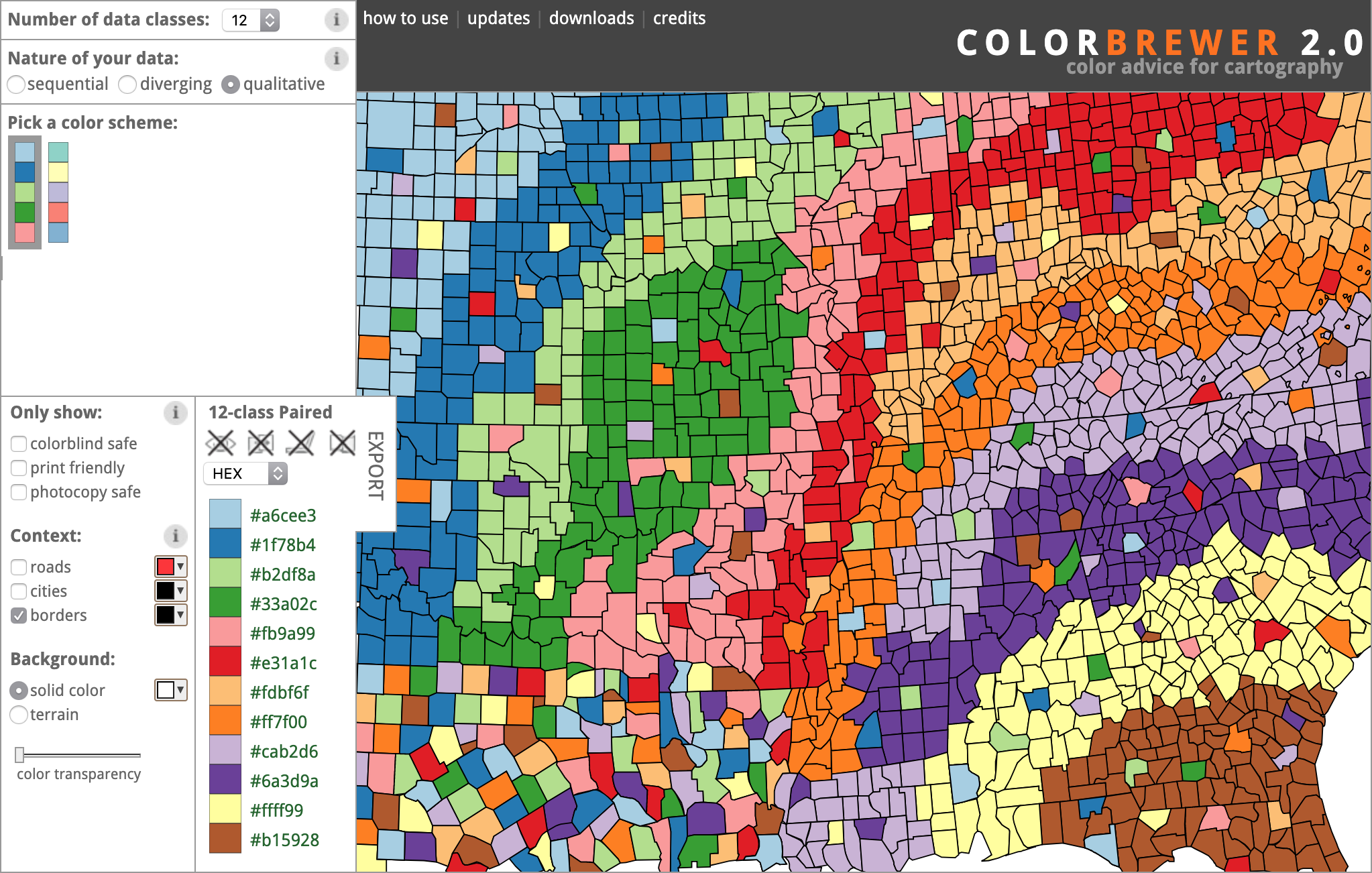
Highlight Colours
Ideally, each provision should be highlighted with a different colour in the document to visually differentiate them. This is especially important when two or more provisions are close to each other. We’d like users to be able to differentiate them by the colours without having to click on the highlight to check which provision they are looking at. This requires us to use a set of colours that are easily distinguishable. Although there was a set of colours we use for branding and product design, they were not chosen to fulfill this purpose.
As it turned out, people in academia, especially in the field of cartography, has been long working on solving this problem. We chose the qualitative colour scheme presented by ColorBrewer by Cynthia A. Brewer from Pennsylvania State University.
Documentation
Since the document viewer is the most complex interface in the product, and future design and development will continue to be done to it, it is crucial that each design decision is well documented, communicated and shared for not only the design team, but product and development.
Although during the final development phase, some design details had to change (based on findings from user testing sessions), but since the design was modular enough, and each decision was well documented, we could easily remove or add functionalities within this structure.
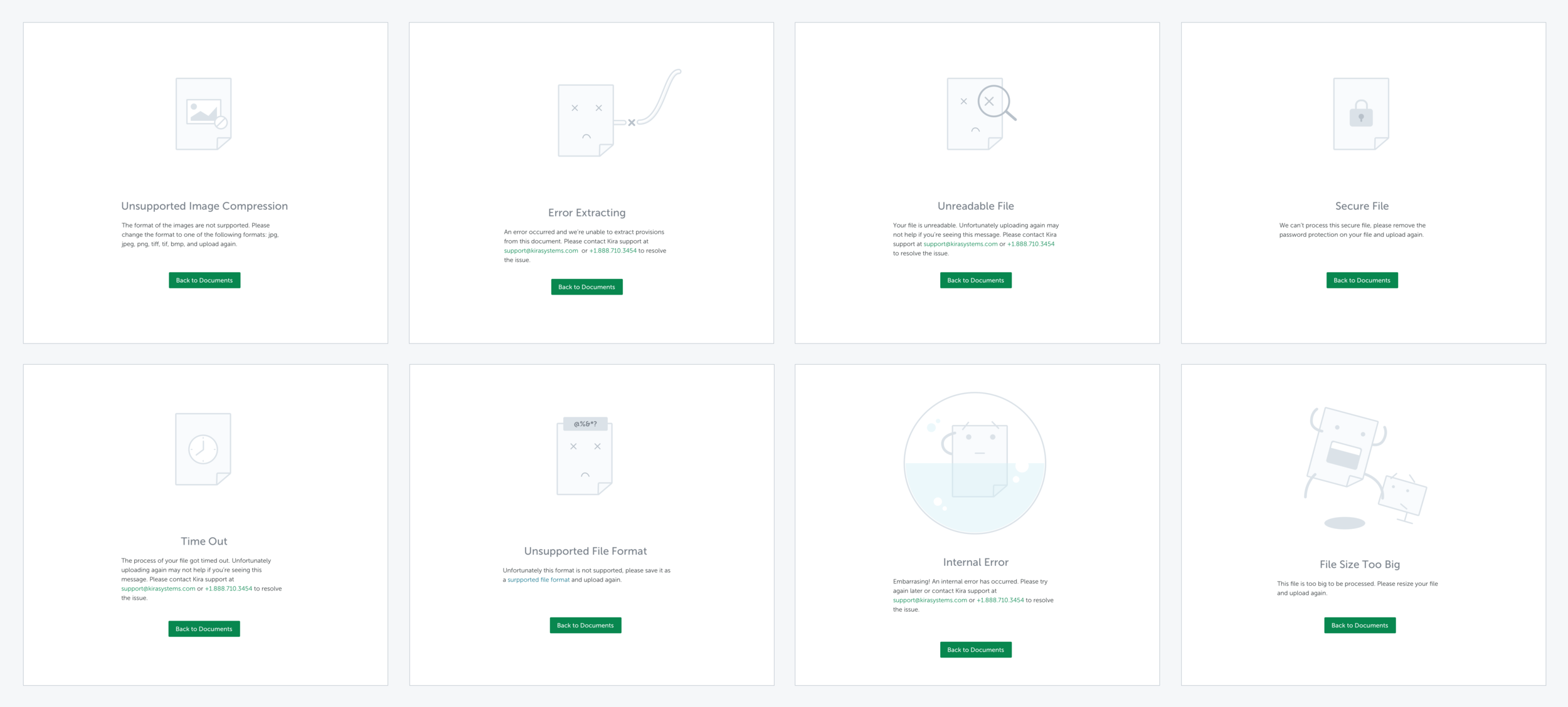
Error states
We understand users’ frustration when a document failed to display—and there can be many reasons. To ease their frustration, I designed and illustrated a set of error messages with appropriate actions.
UI Components
The redesign of the document viewer coincided with the effort to realign and unify the UI components across the app, both from the UI and front-end perspectives (on the front-end side, we were switching from Om to Reagent—the ClojureScript version of React). Thus as part of the redesign and development work, we restructured and rewrote the front-end code (both ClojureScript and CSS) to make the UI component more modular. I took on most of the CSS rewrite, and a little bit of ClojureScript.
Technical considerations
Good UX is more than just the design. In almost all cases, web performance is the most important component when it comes to UX. Together with the developer, we had to decide on how the lazy loading should work (e.g., do we load 3 or 5 pages at a time), how many search results to display upfront when there were too many, and the speed for micro-interactions when there are too many pages to scroll through.
User Testing
Having been working closely with our in-house legal team, I was able to tap into their expertise quite easily. A lot of the design decisions were a result of consulting with them iteratively.
Near the end of the design phase, we conducted 6 semi-formal user testing sessions with a combination of in-house annotators, our support team (who have a strong understanding of user pain points), and mid-level associates throughout the development phase.
This allowed us to work iteratively in both design and development. Having restructured the components to allow the front-end to be more modular also helped us to tweak the design and code more flexibly.
Results
Although lacking the quantitative analytics on the usage of the document viewer, we have received very positive feedback after its release. One of the best examples of this occurred during the phased roll-out: a client firm had the new document viewer turned on a week prematurely, requested it to be turned off, then, three hours later, asked to have it turned back on due to internal user requests for it.
Today, the document viewer is said to be the favourite feature of the product—according to a survey conducted at a big law firm.
Although many new improvements still need to be made, and more functionalities are being added to it to support some new features under development, all the changes can be made within this structure of this design due to its modularity and flexibility.
Recognition
We also wrote an academic paper on the document viewer redesign as it contributed to the information retrieval community from a unique legal perspective. It was published at CHIIR (ACM SIGIR Conference on Human Information Interaction and Retrieval) 2018. If you’re interested, read it here.